 Design
The Psychology of Business Cards
Designed by Kaixer group
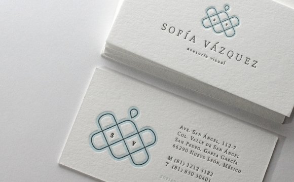
Everyone knows that your name, title, and contact information belong on your business card. But how do you make sure the card doesn’t end up in a desk drawer, never to re-emerge again? For starters, take the time to craft an aesthetically pleasing card that conveys your intended message. These cards are your first impression with other professionals. So make sure the design is impressive and memorable.
You can do this by considering the psychology of the major elements of a business card. Keep in mind that this article won’t be talking about the actual words, so that aspect is up to youBut, these tips will assist you in making great and appropriate design decisions. This will also help to lead to positive interpretations of your brand.
Font Choice
 Aside from the general disdain for Comic Sans, font preference isn’t a common pop culture discussion. So how do you pick which fonts to use?
One of the most basic decisions is whether you want to use serif or sans-serif fonts. Typically, sans-serif fonts are used for titles and headers while serif fonts are for bodies of text.
You can stick with this convention, but no matter what you decide, don’t choose two different fonts of the same type. Like your name in Times New Roman and your other information in Georgia. This presents a cluttered effect, which would have a negative impact on the reader. Stick with one font or use pairs appropriately.
When choosing a typeface, make sure it can be easily read. Think about spacing—between letters, words, and lines. It is because proper spacing allows your brain to process the words faster. One tip is to make sure the line height is larger than the point size of the font.
On a more subjective level, it’s important to consider what your goal is. What mood do you want to communicate? The answer to this question can guide you aesthetically. With so many fonts to choose from, you might have to try several before you land on the right one. Consider the YouTube logo as an example. Imagine if the font were any of these:
They all have a completely different vibe, right? One trick for picking a font is to type out certain characteristics you think the font might possess in that specific font. Is it fun, energetic, tense, etc.?
Seeing the words in the font they potentially correspond with will help you determine if it’s a good match. Also, consider if you can identify the opposite mood of the font. If you can’t, that probably means it’s not very clear and you can pick a better option.
RELATED VIDEO

Share this Post
latest blog posts
-

-
-

-
 Christmas cards offers November 9, 2023
 -
 CVS Christmas card November 5, 2023
 -
 Christmas cards Making November 1, 2023
 -
 Make your own Love cards October 28, 2023
 -
 Cards from October 24, 2023
 -
 American Greetings Boxed Christmas cards October 20, 2023
 -
 Make your own Valentine cards online free October 16, 2023
 -
 Print your own Christmas cards October 12, 2023
 -
 Card companies online October 8, 2023