A critique
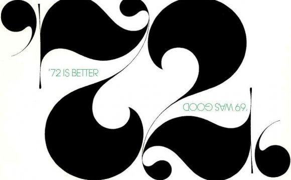
As it is, your text appears too prominent – it attracts attention. While in general not a bad thing, it is when the reader's focus should be on the artwork, not "distracted" by the accompanying text.
The text appears prominent because
- The font size is quite large.
- The font itself is quite dark.
- The text is closely spaced, so there are dense blocks of data.
In addition, a couple of minor points:
- The text is in black.
- The text uses lots of capitals.
You can try a different approach for each of these points, alone or in combination with others:
- A smaller font size,
- a lighter font cut,
- a larger line height ("leading"),
- a tint of black, or possibly an actual color,
- a font that has less prominent capitals; or, for that distinct sense of 'design', use as much lowercase as you can (which will make the capitalized phrases stand out more),
- Some additional tracking to space out the text.
An apology
Is it so 'orrible then? Well no :)
Things that you definitely got right are (1) using a sans serif font for a relatively distant, objective, informative, clean text, (2) an attractive global layout with all main elements centered and a repetition of the 'important' image, (3) lots of white space on the left hand side, to counteract the full page image on the right hand side.
A suggestion
There are not that many really really good fonts that come with your computer– wait, let me rephrase that. There are lots of actually very good fonts that come with your computer, but that is no reason not to look beyond those!
Here is my proposal for the text, using a smaller font, lots more spacing, a 60% shade of black for the text, and a free font: Droid Sans. Also I got rid of a few of the capitals. The text is spaced out using +20 tracking, as with its default this font looks a bit cramped to me.
Consider making the right hand side larger – make it so large it bleeds off the page: "dramatically", rather than having a boring standard white border.
Be careful picking a color for your text. It should not (again) distract too much so don't pick a glaringly bright color. In addition, a color that matches one particular illustration may not match another well (although you could counteract this with picking a specific color for each different image). In my proposal I chose a light tint of gray, hence neutral for most images.
RELATED VIDEO


Share this Post
latest blog posts
-

-
-

-
 Christmas cards offers November 9, 2023
 -
 CVS Christmas card November 5, 2023
 -
 Christmas cards Making November 1, 2023
 -
 Make your own Love cards October 28, 2023
 -
 Cards from October 24, 2023
 -
 American Greetings Boxed Christmas cards October 20, 2023
 -
 Make your own Valentine cards online free October 16, 2023
 -
 Print your own Christmas cards October 12, 2023
 -
 Card companies online October 8, 2023